Splatoon 3 - Mobile Concept
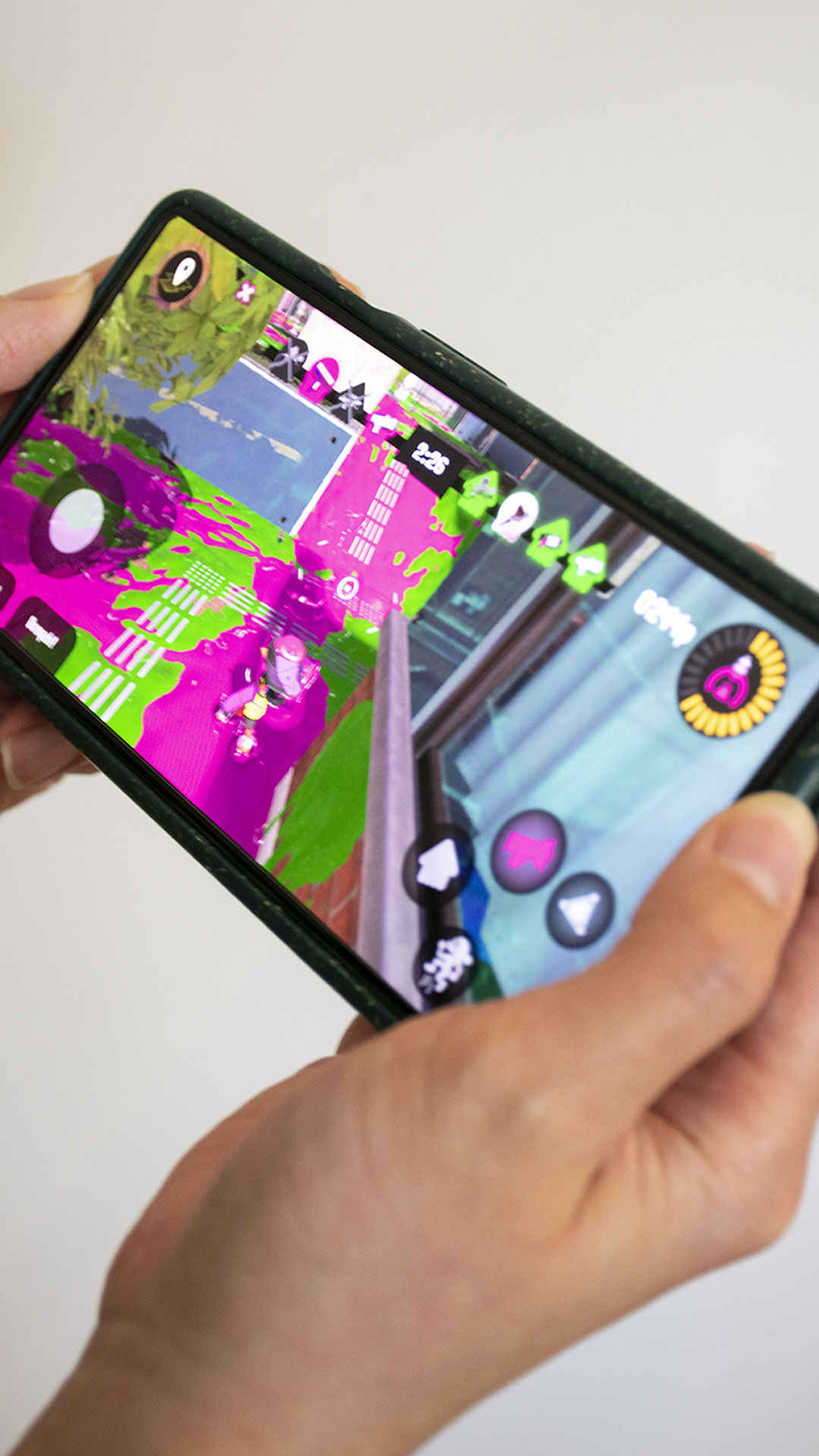
A mobile re-imagining of Nintendo's quirky multiplayer third-person shooter, Splatoon 3.
Roles
UI/UX Designer
Tools Used
Adobe Illustrator, Adobe Photoshop, Figma
Squid? Kid? Splatoon 3?
Splatoon 3 is a third-person shooter game and the third entry in the Splatoon series. It was released in September 2022, and as of December 2022 has sold over 10.13 million units worldwide. The series is best known for its fun and bright aesthetics, as well as interesting gameplay mechanics that set it apart from other games in the shooter genre.
Why make a mobile version?
By making Splatoon 3 available across multiple platforms, it can reach a wider audience. Games such as Genshin Impact and Fortnite have amassed great success due to their availability on PC, console, and mobile.
Business thinking aside, I wanted to give myself a challenge. I wanted to see how a game’s UI/UX experience changes from one platform to another, as well as practice my design skills by replicating Splatoon's visual style by replicating most, if not all the GUI assets from scratch.
Choosing Screens
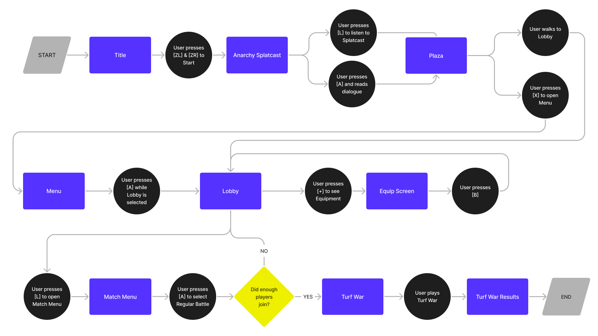
Before starting any sketches, I thought about Splatoon 3’s current user flow, in particular, focusing on a player choosing to participate in a Turf War. While Splatoon 3 has a single player campaign, I chose to focus on the multiplayer aspect as it’s Splatoon 3’s main selling point and most of the assets used in this section are reused or restructured in the single player campaign.
After creating and looking over the user flow, I was able to pick out around five screens that would need the most rework when translating to mobile. These screens include the Equipment Screen, Battle Screen, Respawn Screen, Map Screen, and the Victory Screen.
Equipment Screen
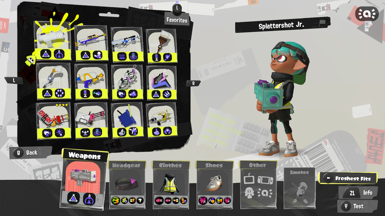
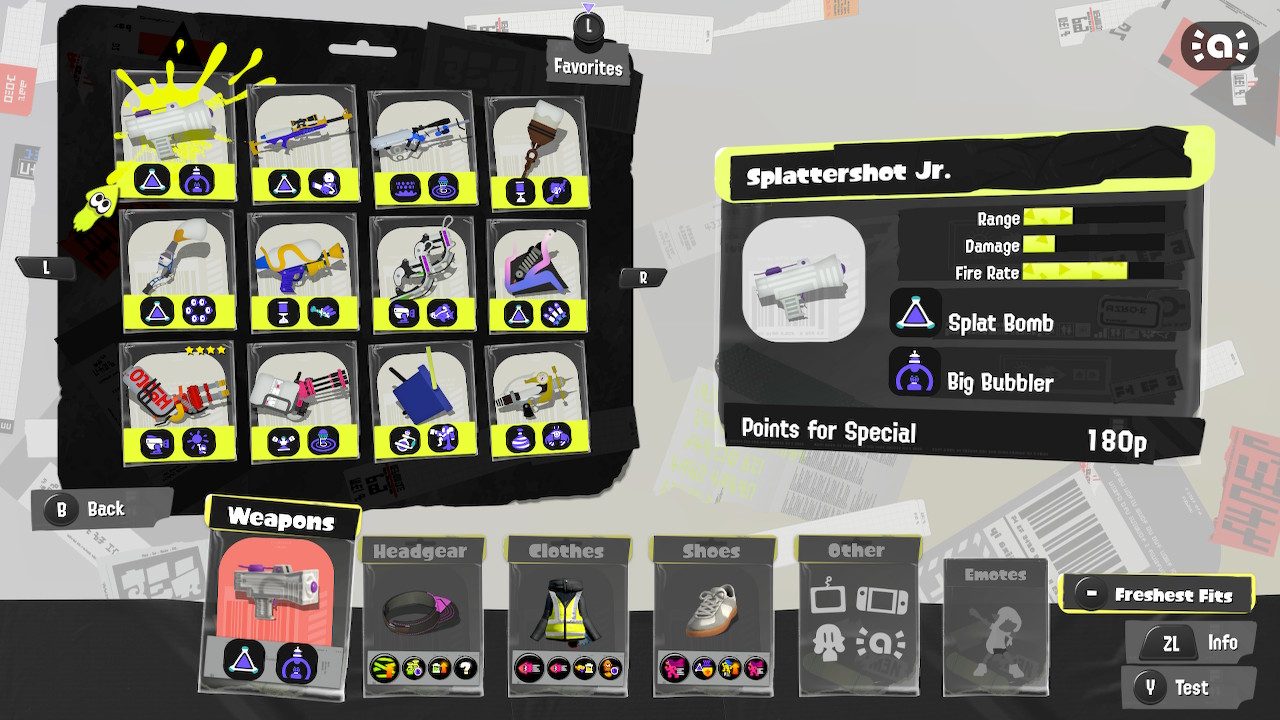
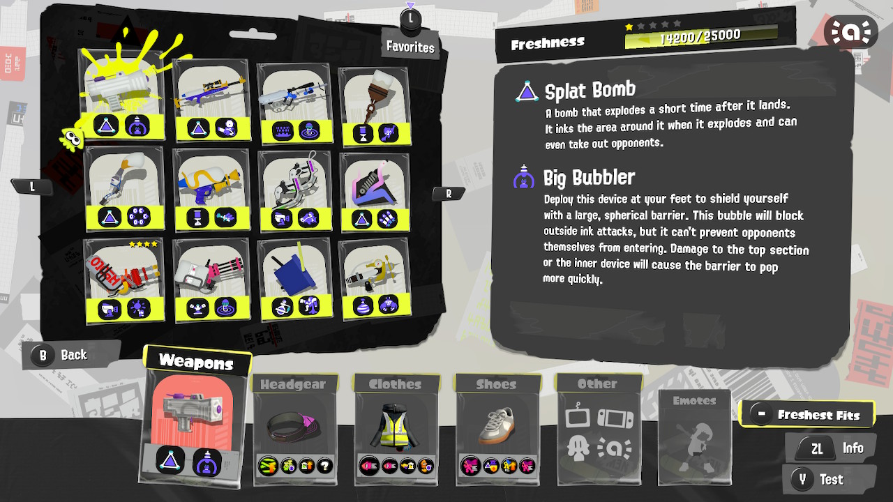
Out of all the screens, the equipment screen in particular needed the most reworking. There’s a lot that the player needs to look at when deciding what weapons and clothes to equip. It’s paramount that they’re able to see the stats and abilities so they can make an optimal build. The current layout of the screen would suffer from readability if it was simply scaled down to fit into a mobile screen.
Original Equipment Screen
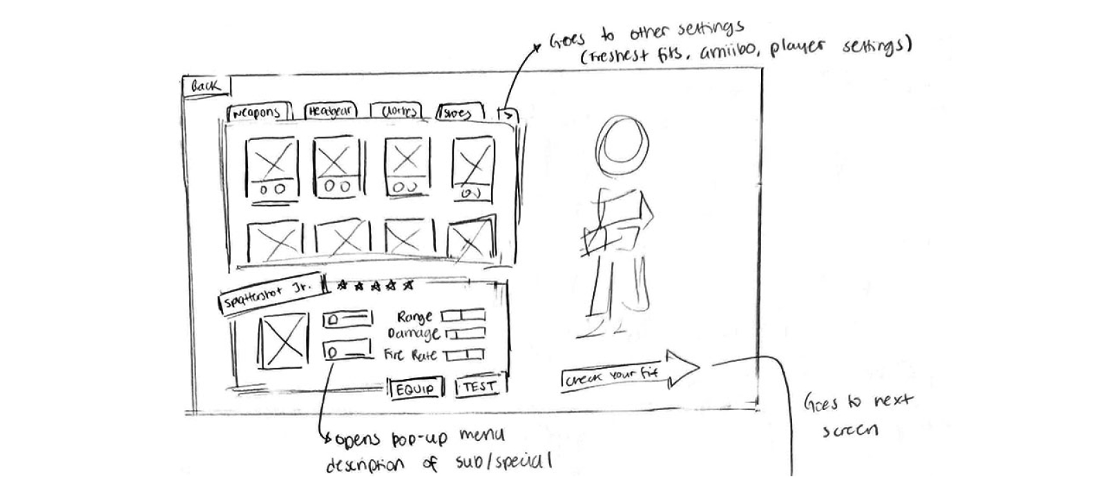
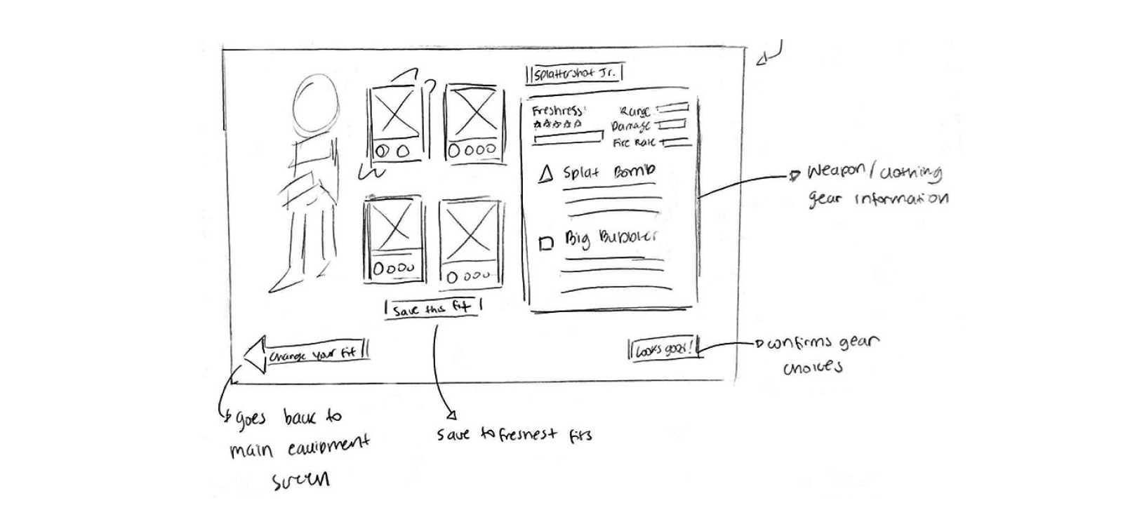
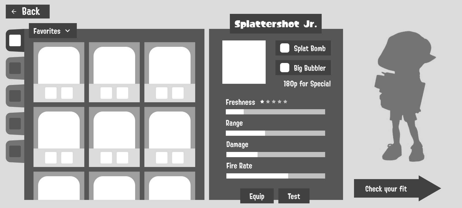
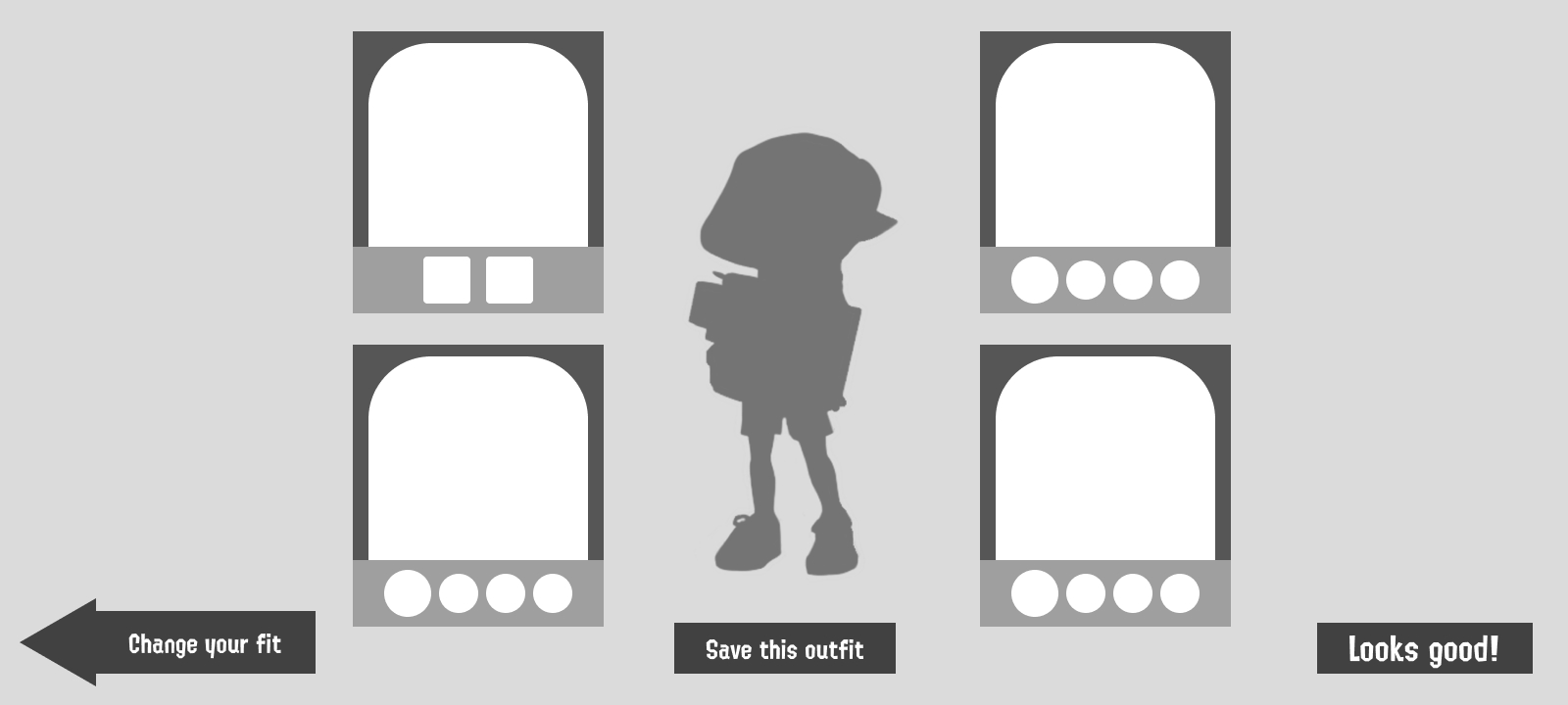
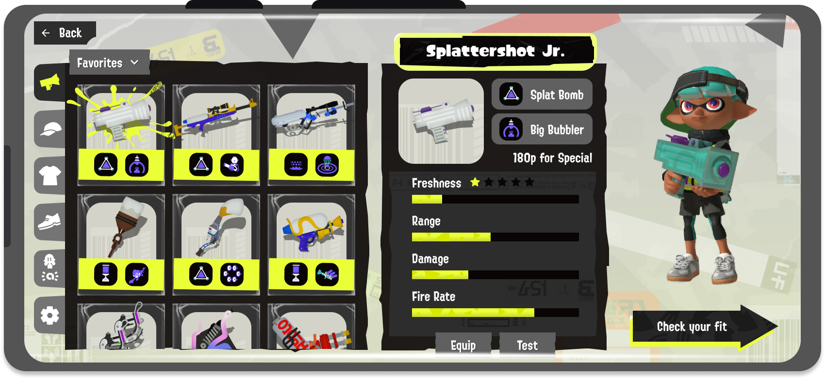
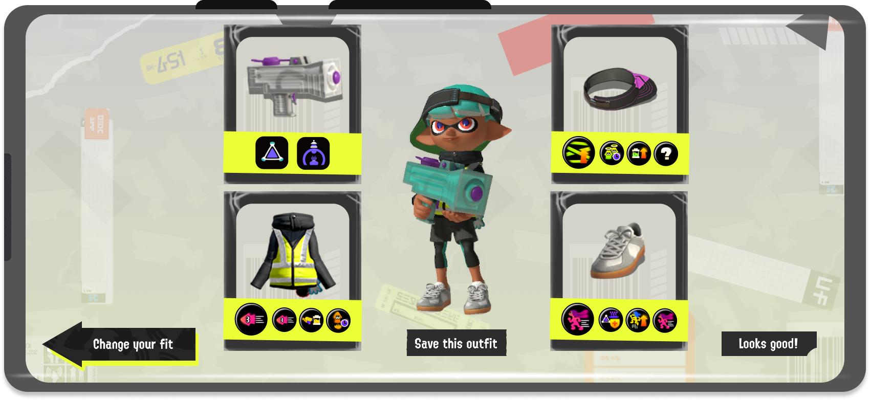
When sketching the wireframe I decided it was best to split the equipment screen into two parts. One screen to allow the player to scroll through their equipment and get an overview of its stats and the next screen to look at their chosen equipment altogether. This way enough information could be included in each screen without overwhelming the player or forcing things to fit.
Mobile Redesign
Wireframe Sketch
Greyscale Wireframes
UI Mockup
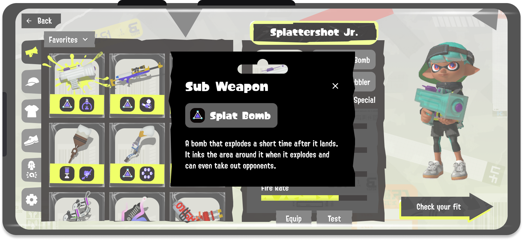
For the first screen, the player can change through equipment sections via the tabs. Instead of having to press buttons to reveal an item’s information, there will be a separate window always on screen to show an item’s stats. Pressing “Back” will bring the user back to the lobby or whichever screen they were previously on, but a prompt will ask them if they would like to save their changes if any were made. Once a user is satisfied with their selections, they can press “Check your fit” to proceed to the next screen.
This screen is simply an overview of the player’s choices and to see if each of their items work well together, to change their equipment they would have to go back to the previous screen by pressing “Change your fit”. Here they can also save the outfit or press “Looks good!” to confirm.
Battle Screen
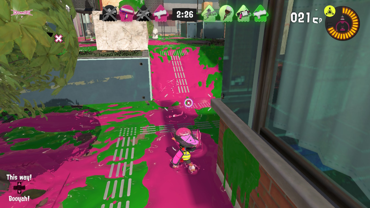
Original Battle Screen
For the battle screen, I had to think about how to represent button functions on the screen without taking up too much space. I looked at other mobile games such as Genshin Impact, Fortnite, and Minecraft to see how they designed their controls and buttons.
Aside from how these buttons should look, I also had to think about how the controls would change for mobile.
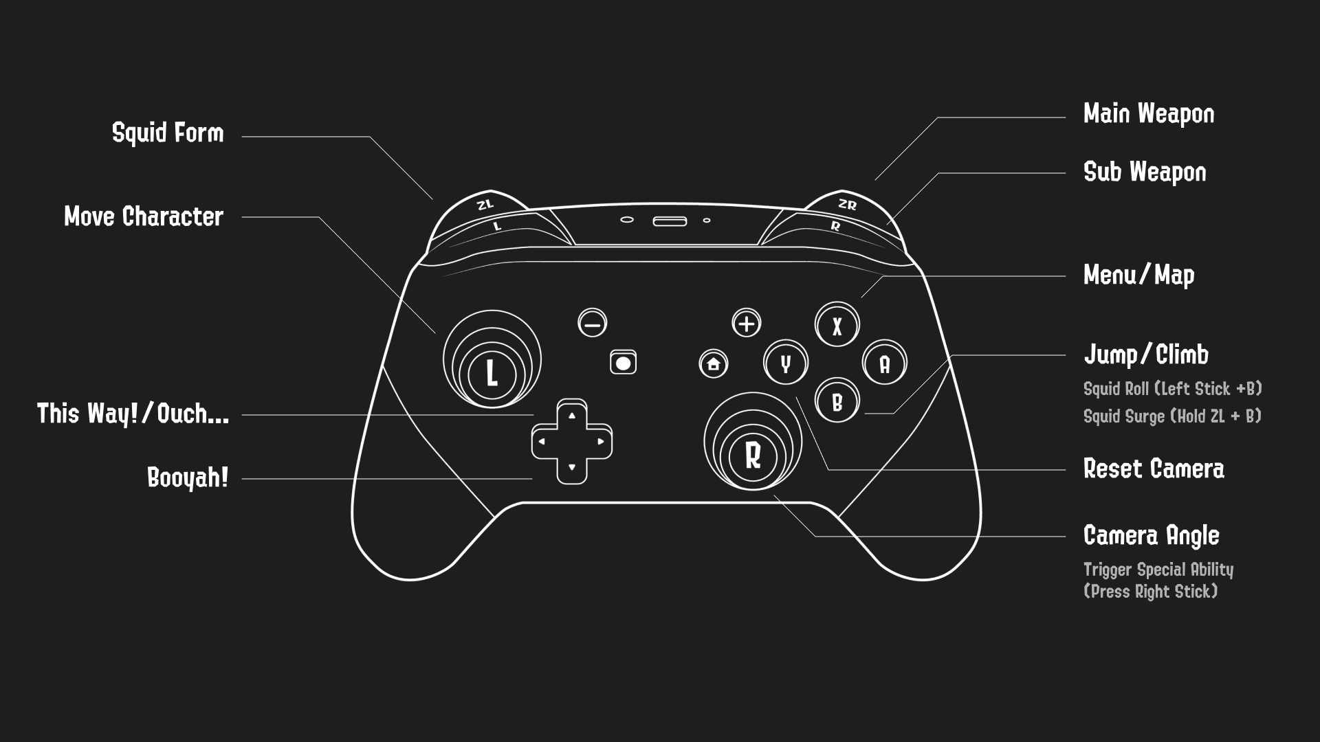
Switch Controller Scheme
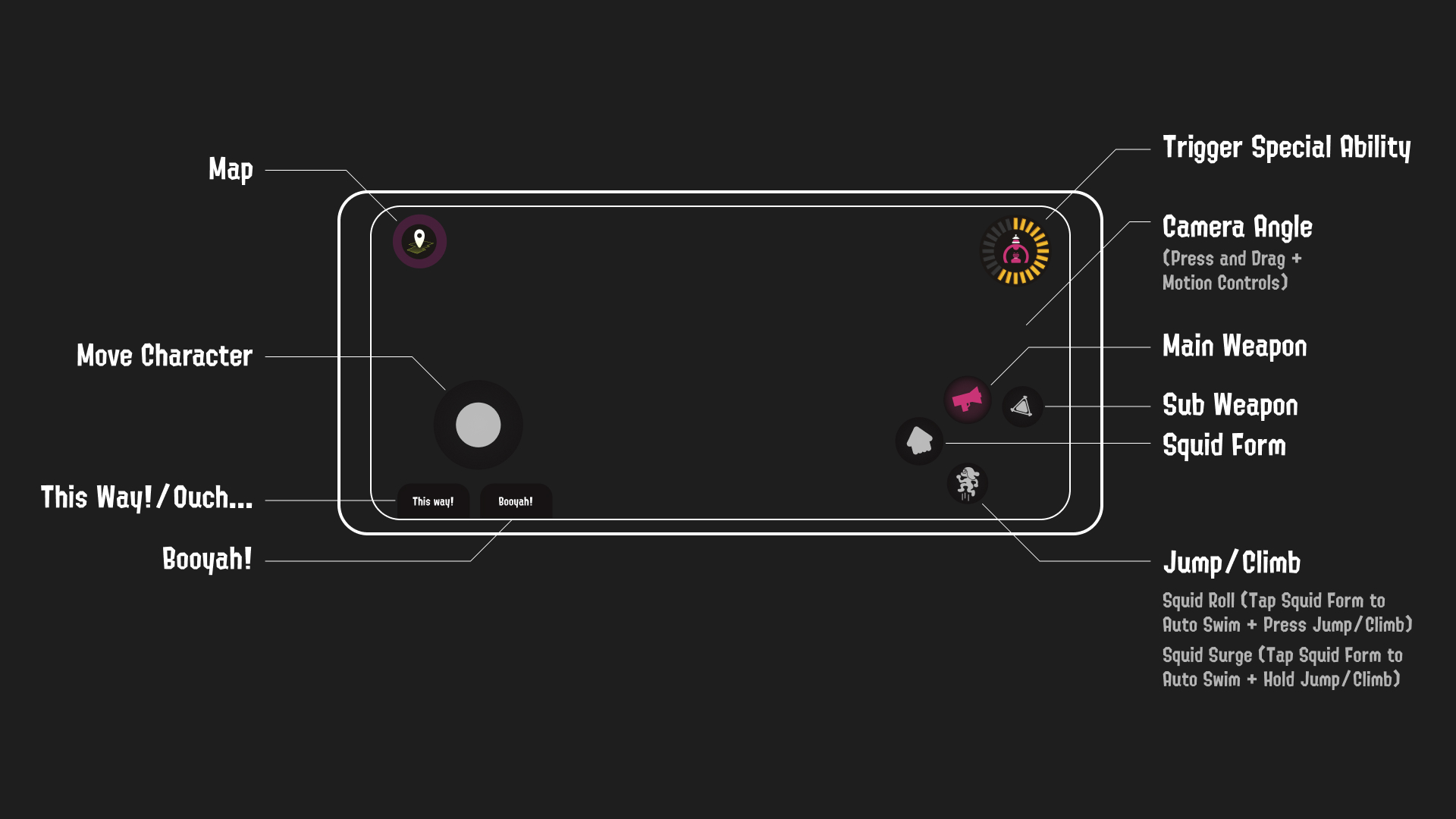
Proposed Mobile Control Scheme
It was important to think about the control scheme as it would dictate which controls would need to have an on-screen button. In the mobile layout I wanted to make sure that although the physical layout of controls would be greatly changed, how things function would remain relatively the same.
Mobile Redesign
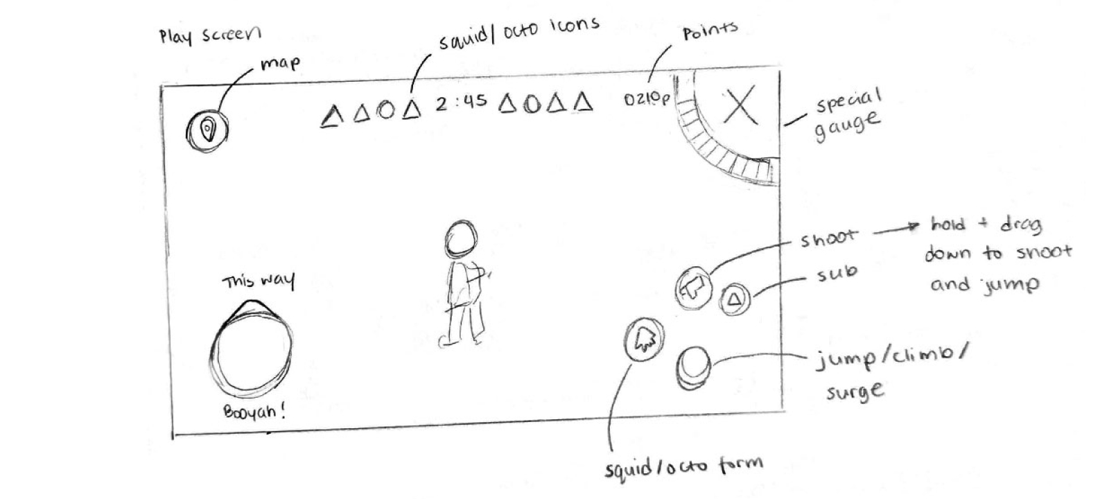
Wireframe Sketch
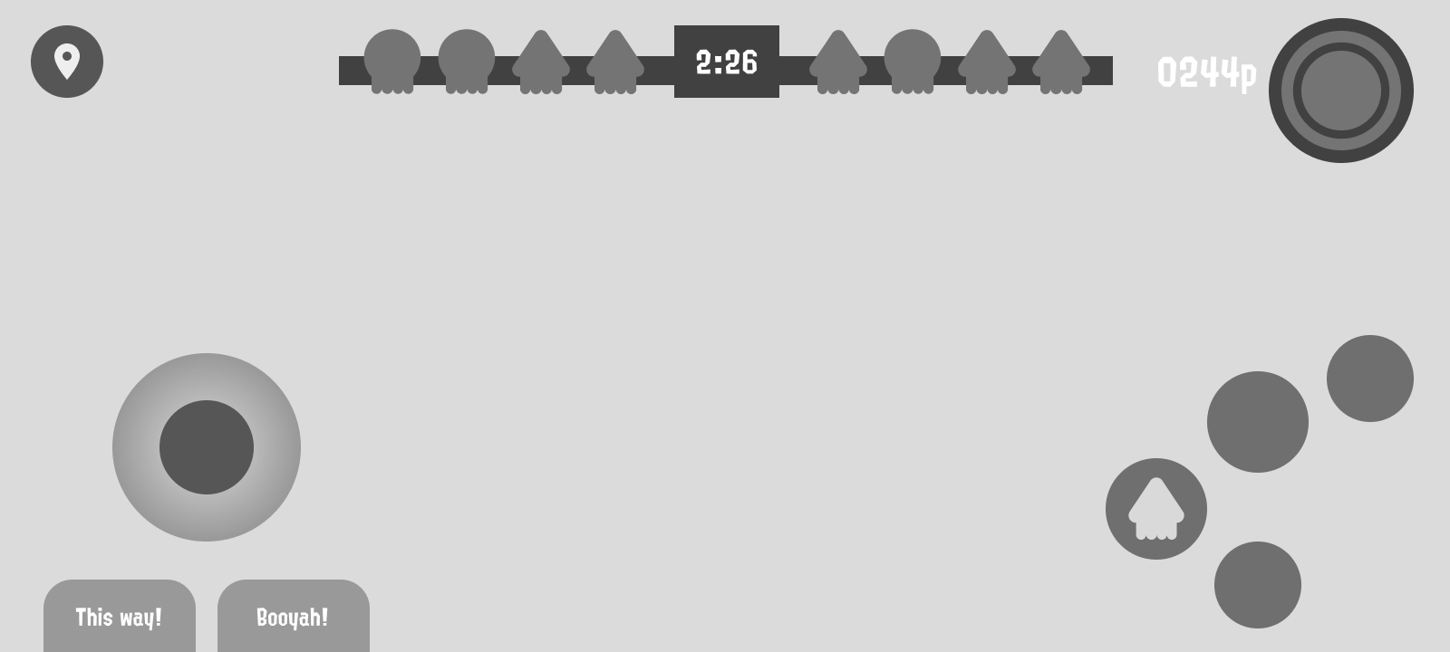
Greyscale Wireframe
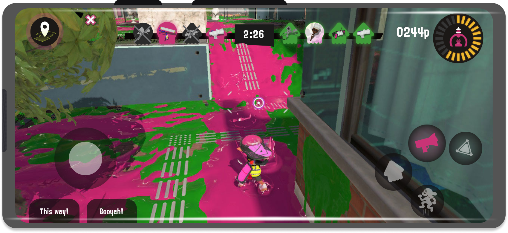
UI Mockup
The most challenging functions to reconfigure for mobile is when players do a combination of movements, i.e. - jumping while shooting, holding charges for certain weapons, squid rolls, and squid surges. For these movements to be possible to do in mobile, players would need to tap either swimming, jumping, or shooting buttons to enable the auto option, and then another button in conjunction to do the desired action.
Redesigned Screens
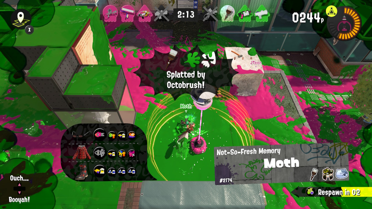
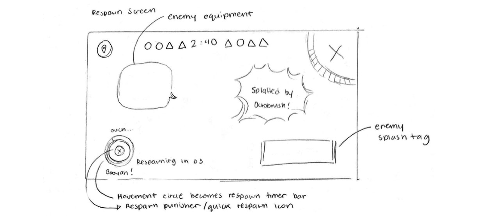
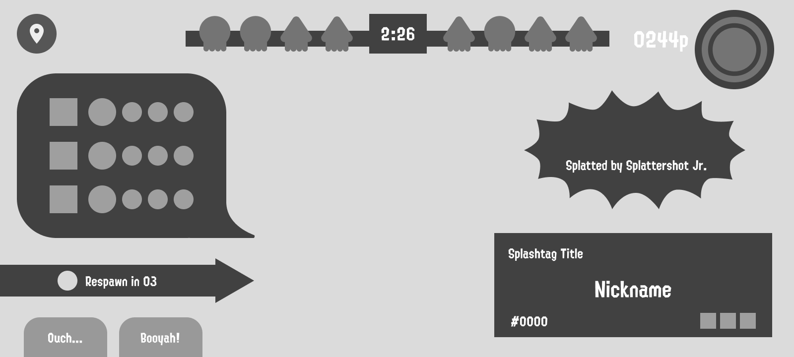
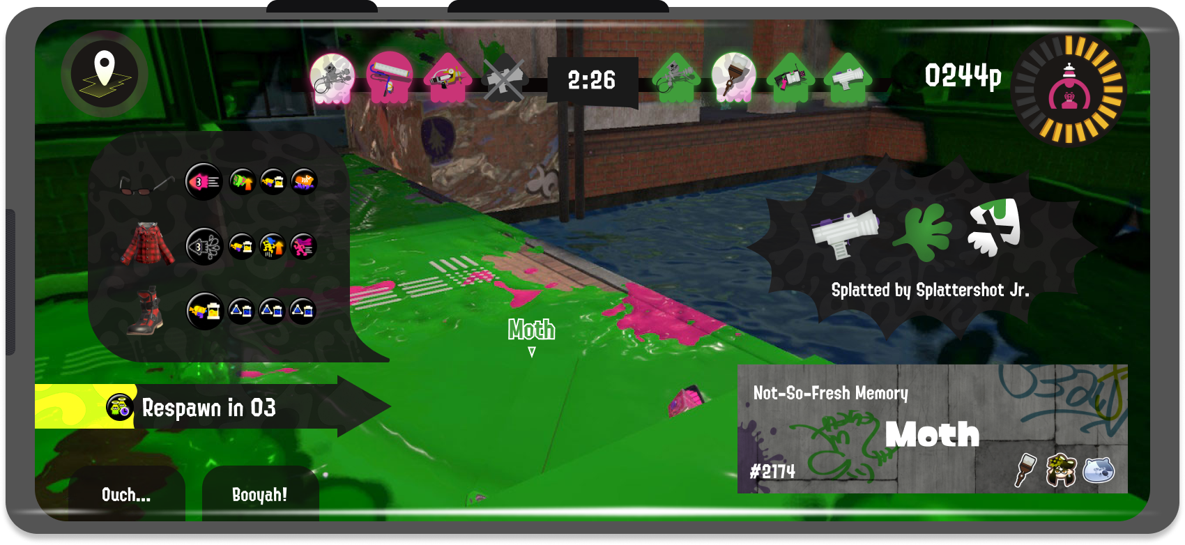
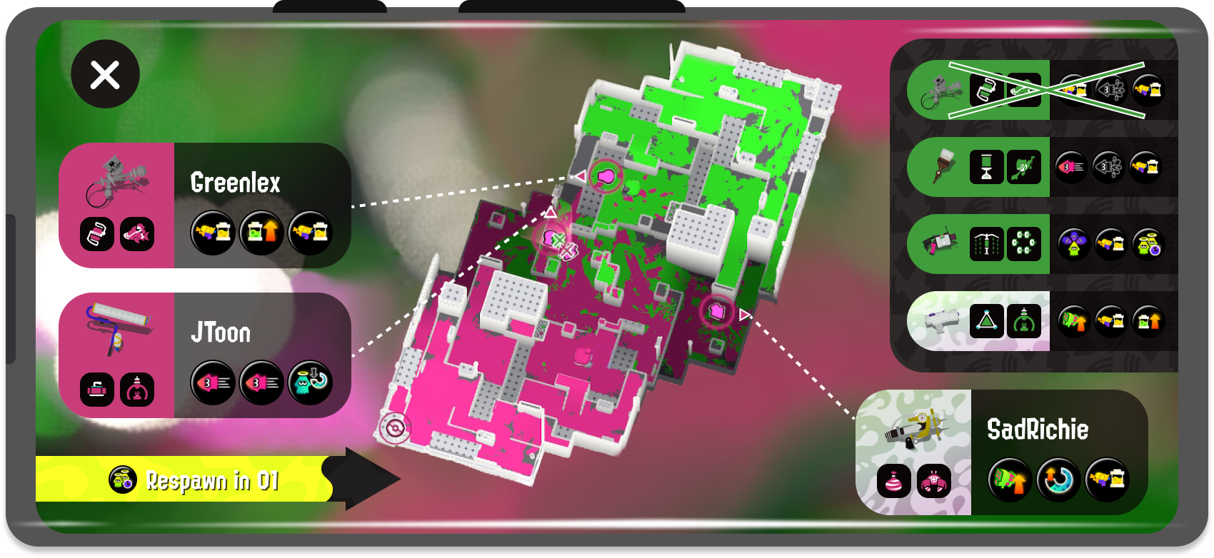
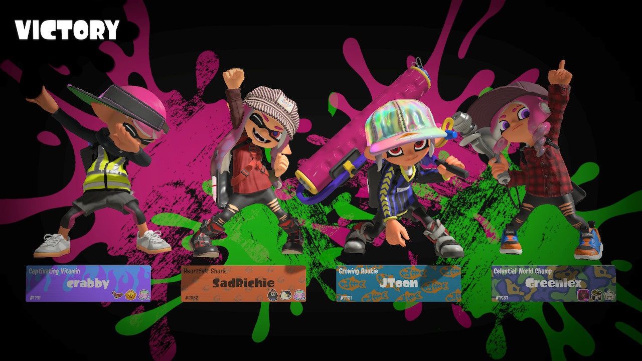
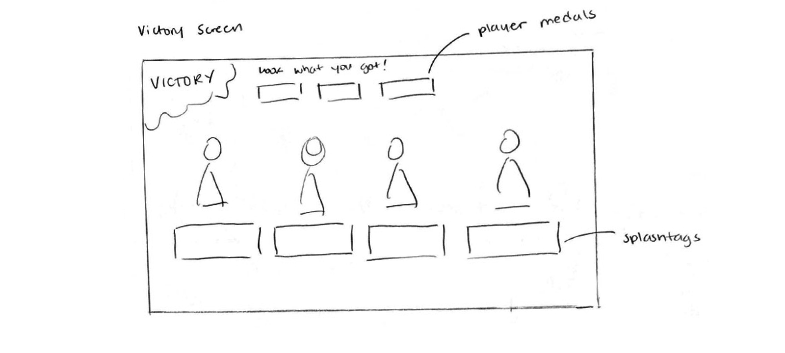
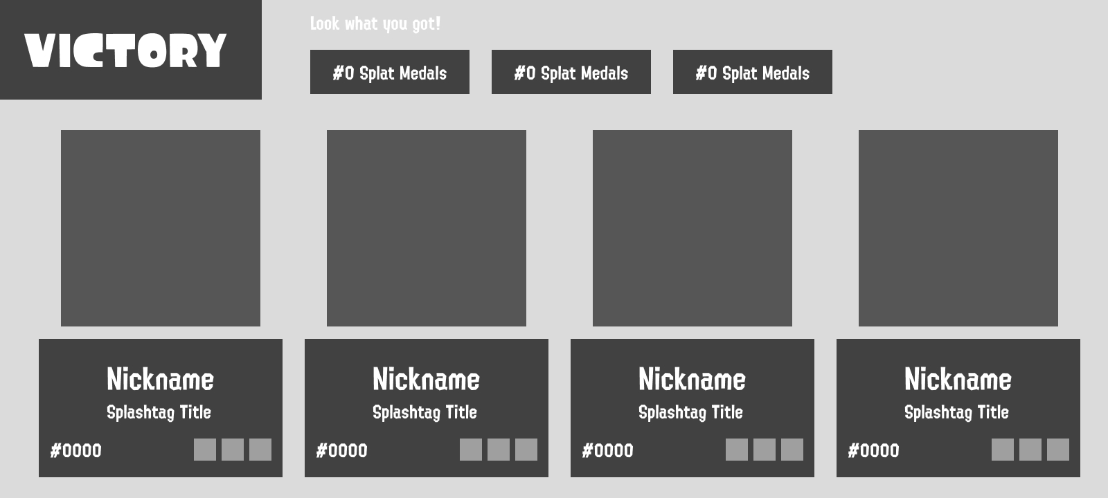
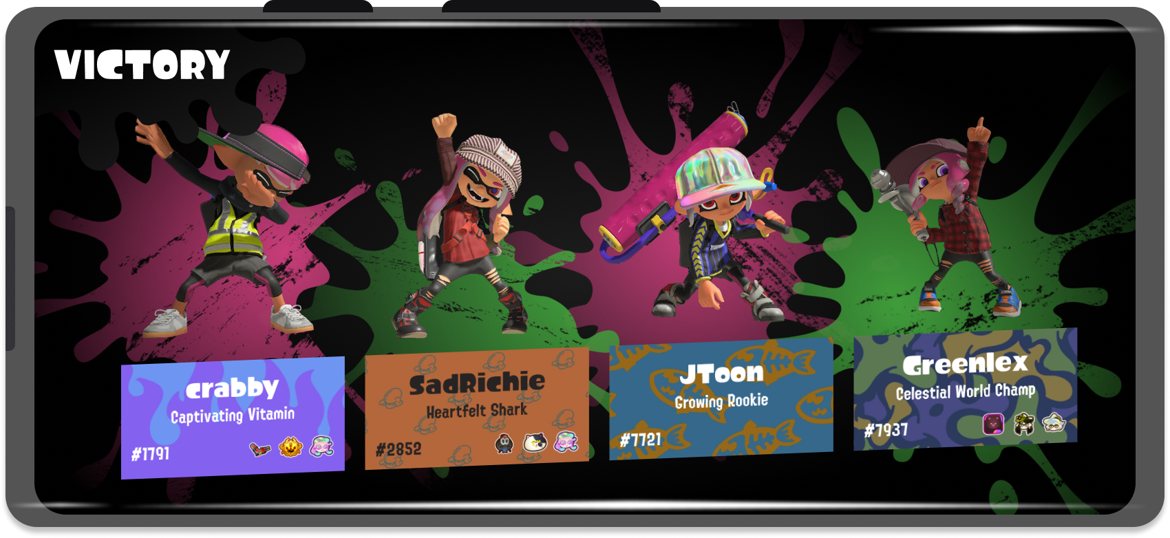
Out of the five screens chosen, these three required the least amount of changes visually. Each screen simply required their visual assets to be scaled and layout slightly changed to better fit a mobile scheme.
Respawn Screen
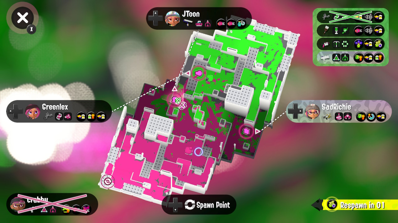
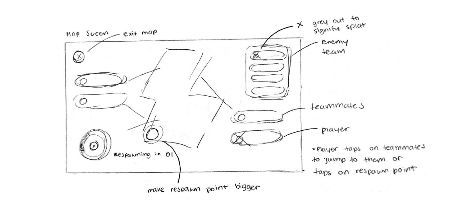
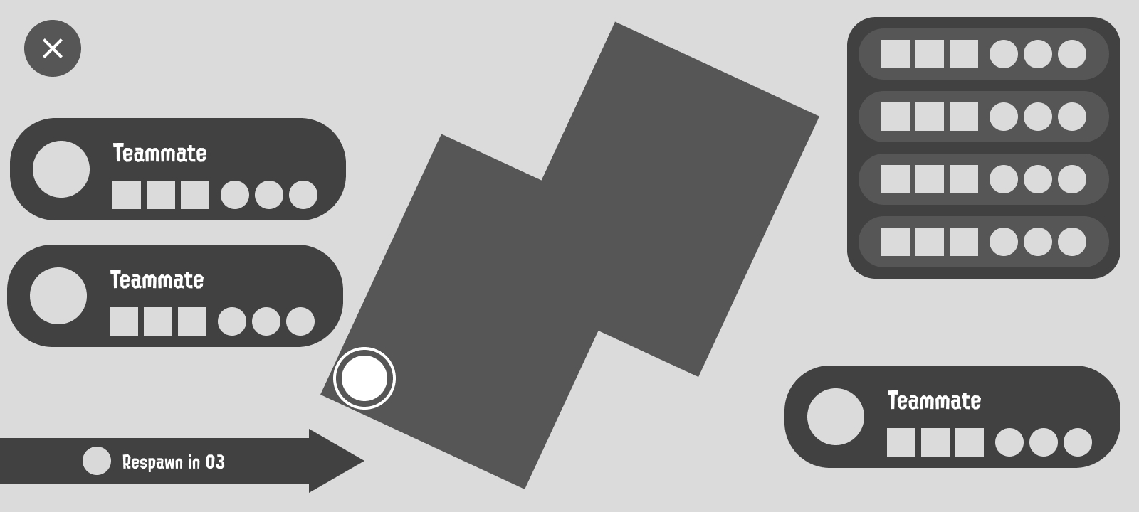
Map Screen
Victory Screen
What I Learned
Creating the UX/UI for a game is really different from playing it! While being familiar with the game helped to inform my design decisions, there were times where I had to think outside of what I knew to come up with solutions that made sense, rather than strictly sticking to what I was comfortable with seeing and experiencing.
Another valuable lesson I learned from this experience was just how much thought goes into cross-platform games. It's so easy as a player to demand that games be available on more devices, but there's a lot to consider when porting a game from one console to another. It's not just the visual aspect of things that changes, but essentially how the game itself functions. Splatoon is not that complicated of a game, but there was still a lot to consider mechanics wise and how it would translate to a mobile format.
Currently open to full-time employment opportunities and other creative projects, let's work on something great!
